Build a powerful Revenue Analytics function. This guide provides actionable strategies for B2B SaaS on data architecture, KPIs, and dashboards that work.
In simple terms, Revenue Analytics is the practice of digging into your revenue-related data to figure out what’s actually driving growth and how to get more of it. It’s about moving your go-to-market strategy from a series of educated guesses to a predictable, well-oiled engine by tying every activity directly to a dollar sign.
Why Most GTM Strategies Are Flying Blind
Your sales team is crushing it, reporting record-high demo numbers. Marketing is celebrating a huge surge in MQLs. On the surface, the activity metrics look fantastic. But when the CFO pulls up the ARR report, growth is disappointingly flat.
Does this scenario feel a bit too real?

Business professionals analyzing revenue analytics data on laptop in modern office workspace
This chasm between frantic activity and actual revenue is a massive blind spot for countless B2B SaaS and Fintech leaders. You're essentially flying a sophisticated jet but navigating with outdated maps and a heavy dose of gut feeling. Without systems that show you what’s actually working, you're making decisions based on noise, not truth.
The Perception vs. Reality Disconnect
The problem is a painful disconnect between what your team reports and what the data reveals. A sales leader might proudly report 85% compliance with follow-up SLAs, but a quick dive into the raw CRM data often shows the true number is closer to a shocking 30%. This isn't about blame; it's about seeing the systemic cracks that traditional, high-level reporting papers over.
Without a solid revenue analytics function, you're left juggling:
- •Vanity Metrics: Impressive-looking numbers like 'leads generated' or 'meetings booked' that ultimately don't correlate to closed-won deals.
- •Inaccurate Forecasts: Relying on subjective "rep confidence" scores instead of hard data on historical conversion rates and sales cycle velocity.
- •Team Misalignment: Sales, marketing, and success teams all operate in their own silos, chasing different definitions of success—none of which are directly tied to revenue.
To get a clearer picture of what a robust revenue analytics function actually covers, here's a breakdown of the core pillars and the critical questions they help you answer.
Core Revenue Analytics Focus Areas
| Pillar | Key Focus | Critical Question Answered |
|---|---|---|
| Performance Measurement | Defining and tracking KPIs that directly link GTM activities to revenue outcomes (e.g., pipeline velocity, CAC payback). | "Are our sales and marketing efforts actually profitable and efficient?" |
| Attribution & ROI | Connecting marketing spend and sales activities to specific deals and revenue streams to calculate true ROI. | "Which channels, campaigns, and activities are giving us the best bang for our buck?" |
| Forecasting & Pipeline Health | Using historical data and leading indicators to predict future revenue with high accuracy and identify risks in the pipeline. | "Are we going to hit our number next quarter, and if not, where are the gaps?" |
| Sales Process Optimization | Analyzing the entire sales cycle to find bottlenecks, improve conversion rates at each stage, and shorten deal cycles. | "Where are our deals getting stuck, and what can we do to fix it?" |
| Customer Lifecycle Analytics | Tracking revenue from initial acquisition through to renewal, upsell, and expansion to understand customer lifetime value. | "Which customer segments are most valuable over the long term?" |
Each of these pillars is designed to replace assumptions with data-backed facts, giving you the clarity needed to make strategic GTM decisions.
As Jason Lemkin, founder of SaaStr, often says, "You can't manage what you don't measure." The goal of revenue analytics isn't just to report numbers; it's to provide the clear, undeniable truth that forces difficult but necessary conversations about what’s actually working.
This guide is your roadmap to building the systems that reveal that truth. We'll walk you through planning and implementing a revenue analytics function that turns your data from a liability into your most valuable strategic asset. You’ll learn how to stop reacting to problems and start proactively driving data-informed growth.
The result? A go-to-market engine where every action is measured, every investment is justified, and growth finally becomes predictable. This is how you stop flying blind and start steering your business with the clarity and confidence you need to win.
Building Your Revenue Analytics Framework
Let's move past the generic advice and build a real blueprint. A solid revenue analytics framework isn’t about tracking every metric under the sun. It’s about zeroing in on the vital few that tie every single action back to a revenue outcome. Get this right, and you create a shared language of performance that finally gets your entire GTM team on the same page.
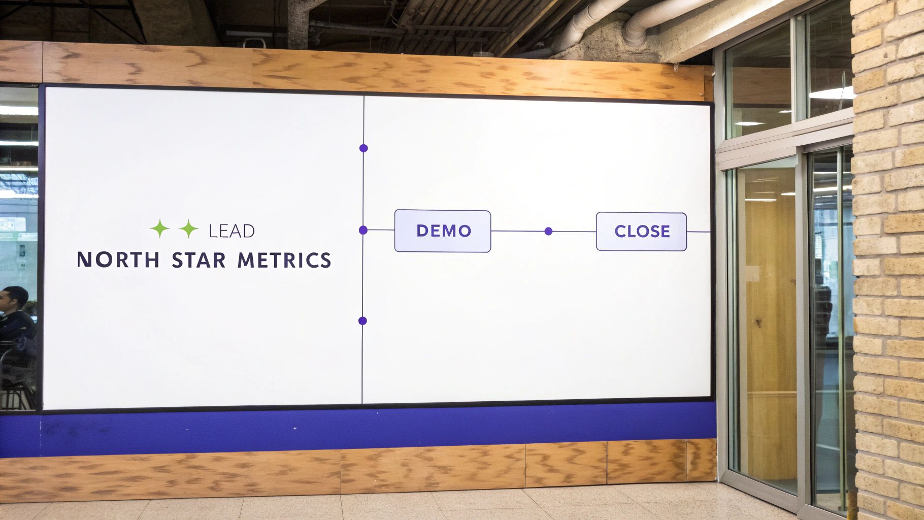
North Star Metrics presentation showing lead journey through demo and close stages workflow diagram
This isn’t just a nice-to-have; it's a global standard. Take the Middle East, particularly the UAE, where revenue analytics adoption is completely changing how businesses operate. Roughly 73% of businesses in the region now lean on revenue analytics to steer their growth.
Even more telling, companies using AI-powered tools are reporting up to a 25% revenue lift compared to those stuck with old-school methods. This shift is all about turning mountains of complex sales data into clear, actionable insights on CAC, win rates, and ARR.
Defining Your North Star Metrics
Your entire framework needs an anchor. This is your "North Star Metric"—a single, high-level number that reflects the long-term health of your company. For most SaaS businesses, this isn't MQLs or demos booked; it has to be a direct measure of revenue health.
Here are the usual suspects:
- •Annual Recurring Revenue (ARR): The lifeblood of any subscription business. It's your predictable revenue over a 12-month period.
- •Net Revenue Retention (NRR): This metric is gold. According to a 2023 study by ChartMogul, the median NRR for SaaS companies with over $10M in ARR is 102%. An NRR over 100% means you're growing even without a single new customer.
Once your North Star is set, the real work begins: identifying the leading indicators that actually influence it. Think of it like a set of dominoes. Pushing over a leading indicator should, logically, cause your North Star to move in the right direction.
A classic mistake is confusing activity metrics like 'emails sent' for leading indicators. True leading indicators are outcomes, like 'Demo-to-Trial Conversion Rate' or 'Average Sales Cycle Length'. They signal progress, not just busyness.
Connecting Leading Indicators to the Customer Journey
Now, map those key leading indicators across the entire customer journey. This is how you see which team's efforts move the needle and where handoffs are breaking down. It creates accountability and ensures everyone is pulling the same rope. For a deeper look at this, check out our guide on the core principles of sustainable revenue growth.
Here’s what this looks like in practice:
- •Marketing: Owns the MQL-to-SQL Conversion Rate. This metric ruthlessly exposes lead quality, not just volume.
- •Sales: Is on the hook for Pipeline Velocity. How fast are qualified opportunities moving from stage to stage and turning into closed-won deals?
- •Customer Success: Focuses on Product Adoption Rate. Are new customers actually using the features that correlate with long-term value and expansion revenue?
Choosing the Right Attribution Model
Ah, attribution. This is where so many revenue analytics projects go to die. Endless debates over first-touch versus last-touch can paralyze an entire organization for months.
The secret? Start simple. Pick a model that generally reflects your customer journey and commit to it for a while.
Let’s use a common scenario: A prospect sees a webinar (first touch), downloads an ebook two weeks later, has three sales calls, and then signs after getting the proposal (last touch).
- •First-Touch Model: The webinar gets 100% of the revenue credit. It's simple, but it completely ignores the hard work sales did to actually close the deal.
- •Last-Touch Model: The proposal gets all the credit. This model overlooks the marketing efforts that brought the lead in the door in the first place.
- •Linear Model: Credit is split evenly across every touchpoint. This feels fairer, but it wrongly assumes a webinar had the same impact as the final demo.
- •U-Shaped (Position-Based) Model: This is often the most practical starting point. It gives 40% of the credit to the first touch (the webinar) and 40% to the deal-closing touch (the proposal), then sprinkles the remaining 20% across the middle interactions.
My advice? Start with a U-shaped or linear model. The goal isn’t perfect, unassailable attribution on day one. It’s to get a baseline that forces marketing, sales, and success to speak the same language: the language of direct contribution to revenue.
Designing Your Data Architecture and Tech Stack
Let's get into the technical weeds, but in a way that actually helps you as a GTM leader. Your revenue analytics are only as good as the plumbing underneath. Without a solid data foundation, you’re just creating prettier reports from messy, untrustworthy information.
The entire goal is to build a single source of truth (SSoT). This isn't just another buzzword; it's a non-negotiable for getting accurate insights. It means that when your sales leader pulls a pipeline number from Salesforce and your marketing head pulls a lead conversion number from HubSpot, they are drawing from the exact same unified, clean dataset. No more "my number vs. your number" debates in leadership meetings.
This isn’t just a startup problem. Even massive organizations struggle with this. A Gartner survey found that poor data quality costs organizations an average of $12.9 million per year. By building a modern, unified data environment, you can establish an SSoT that finally allows your analysts to deliver reliable and authoritative insights.
Architecting Your Central Data Hub
For a growing B2B SaaS company, your architecture doesn’t need to be overwhelmingly complex. In fact, simpler is better. The key is establishing a logical flow that centralizes data before you even think about analyzing it.
Your raw data comes from a few usual suspects:
- •CRM: This is the heart of your GTM data. Think Salesforce or HubSpot, where all your deal, account, and contact information lives.
- •Marketing Automation: Platforms like Marketo or Pardot track campaign engagement, email opens, and web activity.
- •Product Analytics: Tools like Mixpanel or Amplitude tell you what users are actually doing inside your application.
- •Financial System: Your accounting software (e.g., Xero, QuickBooks) holds the ultimate truth on bookings and cash collected.
The problem? These systems don't talk to each other out of the box. Manually exporting CSVs every week is a recipe for errors, wasted time, and soul-crushing busywork. The real solution is to pipe all this data into a central repository.
A data warehouse like Google BigQuery, Amazon Redshift, or Snowflake acts as your single source of truth. It’s a specialized database built to handle large-scale analytics, allowing you to join data from different sources to see the full customer journey in one place.
Assembling Your GTM Tech Stack
With your architecture defined, selecting and integrating the right tools becomes much clearer. The goal is to create a seamless flow of information from the first touchpoint all the way to the final renewal.
If you're looking for a more detailed breakdown, our guide to building a B2B SaaS revenue operations tech stack provides an even deeper dive into the specific tools for each growth stage.
To get started, you need to connect the essential systems that feed your single source of truth.
Essential GTM Tech Stack Integrations
| Tool Category | Example Tools | Primary Data Contribution |
|---|---|---|
| CRM | Salesforce, HubSpot | Deal stages, pipeline value, sales activities, account information, contact data. |
| Marketing Automation | Marketo, Pardot, ActiveCampaign | Lead source, campaign engagement, email metrics, website behavior tracking. |
| Data Warehouse | Google BigQuery, Snowflake | A central, unified repository for all GTM data from disparate sources. |
| BI & Visualization | Tableau, Looker Studio | User-friendly dashboards and reports built on top of the data warehouse. |
This table shows how each piece of the puzzle contributes a critical dataset. The CRM provides the "what" of your deals, Marketing Automation tells you the "how" of their origin, and the BI tool lets you visualize it all from the unified data in your warehouse.
Conducting a Practical Data Audit
Before you can build anything, you need to know what you’re working with. A "data audit" sounds intimidating, but you can start small and create immediate value. Forget boiling the ocean. Instead, focus on the data points required to answer one critical business question, like: "What is our true lead-to-close conversion rate by source?"
Use this simple checklist to get started:
- •Identify Critical Fields: For the question above, you'll need fields like
Lead Source,Created Date,Opportunity Created Date, andClosed-Won Date. Find where they live. - •Assess Field Completion: Run a quick report. What percentage of your lead records have a blank
Lead Sourcefield? If it's over 10%, you have a data capture problem that needs to be fixed at the source. - •Check for Consistency: Are there multiple variations for the same source (e.g., "linkedin," "LinkedIn Ads," "LI")? This needs to be standardized with picklists or automation, otherwise your reporting will be a mess.
- •Validate Timestamps: Are your
Created DateandClosed-Won Datefields accurate? Inaccurate timestamps will completely derail any attempt to measure your sales cycle length.
Fixing these small, foundational data issues is the most important—and least glamorous—step in the entire process. But it’s the work that makes every dashboard and insight trustworthy down the line.
Creating Dashboards That Drive Action
A dashboard gathering digital dust is worse than no dashboard at all. It gives you the illusion of being data-driven without any of the actual benefits. The goal was never to build beautiful charts. It's to design focused, role-specific views that force your teams to ask the right questions and take immediate, intelligent action.
Forget those overwhelming displays packed with dozens of metrics. Real revenue analytics dashboards cut through the noise of vanity stats to deliver undeniable truths about performance. We'll focus on three essential dashboards your B2B SaaS or Fintech company needs right now. For each one, we'll cover not just what to track, but more importantly, how to interpret the data and what to do next.
The GTM Leadership Dashboard
Think of this as the executive command center. It’s built for CEOs, CROs, and VPs to get a high-level, real-time pulse on the health of the entire revenue engine. Its primary job is to answer two simple questions: "Are we on track to hit our number?" and "If not, why?"
Key metrics for this dashboard include:
- •Pipeline Coverage: Your total open pipeline value divided by your quarterly revenue target. Best-in-class companies aim for a 3x to 5x coverage ratio to ensure a healthy buffer against slipped deals and uncertainty.
- •Pipeline Velocity: The speed at which deals move through your sales funnel, measured in ARR per day. A decreasing velocity is a massive red flag that deals are stalling somewhere.
- •Forecast Accuracy: The percentage of your forecasted revenue that you actually closed in a given period. If you’re consistently falling below 85-90%, it signals a systemic problem in how your team qualifies and commits deals.
How to Interpret and Act: If Pipeline Velocity drops by 15% month-over-month, don't just note it—dig deeper. Isolate the exact sales stage where deals are getting stuck. A bottleneck at the "Proposal Sent" stage might mean your pricing is too complex or your value prop isn't landing, prompting an urgent review of your sales collateral and negotiation training.
The Sales Performance Dashboard
This dashboard is for the front lines—your sales managers and individual Account Executives. It moves beyond high-level strategy to zero in on the specific activities and outcomes that drive quota attainment. It’s all about individual accountability and creating coaching opportunities.
Focus on these core performance indicators:
- •Quota Attainment %: The ultimate measure of a salesperson's success. This should be easily viewable by individual, team, and region.
- •Average Deal Cycle Length: How long it takes for an AE to close a deal from opportunity creation. If one rep’s cycle is 30 days longer than the team average, that's a perfect coaching moment.
- •Win Rate by Stage: This shows your conversion rates between each step of the sales process. A steep drop-off from "Demo" to "Trial" could reveal a gap in product qualification or poor demo quality.
Your goal here is to spot deviations from the norm. An AE with a high number of demos but a low win rate isn't lazy; they're likely struggling with qualification. This dashboard turns a manager's gut feeling into a data-backed coaching conversation.
The Marketing ROI Dashboard
For your marketing team, this is the moment of truth. This dashboard ruthlessly connects every dollar of marketing spend to its direct impact on sales pipeline and closed revenue. It’s where you finally stop debating lead quality and start measuring marketing’s tangible contribution.
Essential metrics to track include:
- •MQL-to-SQL Conversion Rate: This is arguably the single most important metric for judging lead quality. A low rate means marketing is generating interest, but not from the right people.
- •Cost Per Acquisition (CPA) by Channel: This shows which channels (e.g., LinkedIn Ads, Google Search, Content Syndication) are the most efficient at generating actual customers, not just clicks.
- •Pipeline Sourced by Marketing: The total value of sales opportunities that originated from a marketing campaign. This is your marketing team's direct contribution to the revenue target.
Interpreting this data is what separates good from great. For instance, discovering your LinkedIn Ads have a high CPA but a fantastic MQL-to-SQL rate of 25% means you should double down on that channel, even if it seems expensive upfront. This kind of insight is precisely why understanding your attribution model is a critical piece of the puzzle.
These focused dashboards are quickly becoming standard practice, not just a luxury. The data analytics market in the Middle East & Africa, for example, generated around USD 5.94 billion in 2024 and is set to grow at a 16.8% CAGR through 2030. Predictive analytics, which powers these kinds of insights, makes up nearly 39.33% of that market, showing a clear trend toward using historical data to forecast trends and optimize GTM strategies. You can learn more about the MEA data analytics market growth on grandviewresearch.com.
By building these dashboards, you're not just visualizing data; you're creating a system of accountability that drives smarter, faster, and more profitable decisions across your entire go-to-market team.
Your 90-Day Implementation Plan
Strategy is nothing without execution. This is where your abstract revenue analytics framework becomes a real, tangible asset that drives decisions. We’re moving from planning to doing with a practical 90-day roadmap designed to deliver early wins and build unstoppable momentum across your go-to-market teams.
Think of this as the critical path from getting leadership on the same page to putting actionable dashboards in front of your sales and marketing folks.

Business timeline diagram showing leadership search icon connecting to sales growth chart and marketing target goal
Following this process ensures that every dashboard you build is directly tied to the strategic goals defined by leadership and the real-world operational needs of your revenue-generating teams.
Phase 1: The First 30 Days (Weeks 1-4) - Foundation & Alignment
The first month is all about pouring a solid foundation. I’ve seen countless analytics projects fail because teams rush this stage. You have to get alignment and define what success looks like before you write a single line of code or build one chart.
- •Week 1: Stakeholder Alignment & KPI Definition: Get all your GTM leaders in a room. The only goal here is to agree on the North Star metrics and leading indicators we talked about earlier.
- •Actionable Tactic: Use a workshop to define and document 1-2 North Star Metrics (like ARR or NRR) and 3-5 primary leading indicators for Sales, Marketing, and Success.
- •Measurement Criteria: Success = Signed-off documentation of all key metrics and their exact definitions. No more "my number versus your number" arguments.
- •Week 2: Focused Data Audit & Cleanup Sprint: With your KPIs locked in, you now know precisely which data fields matter most. Run a targeted audit on these specific fields within your CRM.
- •Actionable Tactic: Identify the top 5-10 critical data fields for your KPIs. Run a report to check for completion rates and consistency.
- •Measurement Criteria: Success = A 50% reduction in inconsistencies (e.g., standardizing "Lead Source" field) through a mix of manual cleanup and new validation rules.
- •Weeks 3-4: Initial Dashboard Mockups & Testing: Now it’s time to start building. Create the first iteration of your GTM Leadership dashboard. The goal is to get a functional V1 into the hands of your leadership team for feedback.
- •Actionable Tactic: Build the GTM Leadership dashboard focusing only on the agreed-upon North Star and leading indicators.
- •Measurement Criteria: Success = The leadership team uses the dashboard in their weekly meeting to answer at least one strategic question about pipeline health.
Phase 2: The Next 60 Days (Weeks 5-12) - Momentum & Governance
With a baseline established, the next 60 days are about expanding your capabilities and proving the value of this new function. You'll secure quick wins and formalize the processes that keep your data trustworthy over the long haul.
- •Weeks 5-8: Securing Quick Wins: Use your new dashboard to find the lowest-hanging fruit. This is how you demonstrate immediate ROI and get buy-in for the long road ahead.
- •Actionable Tactic: Use this 3-question framework to identify pipeline bottlenecks:
- •Which marketing channel has the highest MQL-to-SQL rate but the lowest budget?
- •Which sales rep has a deal cycle 30%+ longer than the team average?
- •Where is our biggest conversion drop-off between sales stages?
- •Measurement Criteria: Success = You've implemented at least one strategic change based on these findings (e.g., reallocating marketing budget to a high-performing channel).
- •Actionable Tactic: Use this 3-question framework to identify pipeline bottlenecks:
"Desperate times don’t call for desperate measures. Hasty steps taken in desperation will screw your recovery... Just like medical triage, the unemotional objective must be to do the most good for the greatest number of people—with a critical eye towards long-term outcomes." – Robert Cross, Revenue Management Expert
- •Weeks 9-12: Establishing Data Governance: Finally, you need to make your data integrity sustainable. "Data governance" sounds intimidating, but it just boils down to simple rules of engagement.
- •Actionable Tactic: Create a simple "Data Dictionary" that defines ownership, update cadence (e.g., call notes logged in CRM within 24 hours), and a monthly data-health checkup process.
- •Measurement Criteria: Success = A documented data governance plan is in place and has been communicated to all GTM teams.
This disciplined, data-first approach is becoming essential. For context, the GCC revenue management market hit USD 175.9 million in 2024 and is projected to grow at a 14.7% CAGR. This growth signals a major regional shift toward data-centric strategies, even if high implementation costs are a hurdle. You can read more about the trends in the Middle East and Africa revenue management market.
By the end of these 90 days, you won’t just have a few shiny dashboards. You’ll have a repeatable process for turning data into revenue and can expect a 15–25% improvement in pipeline velocity within 6 weeks of completion.
Answering the Tough Questions About Revenue Analytics
Even the best-laid plans run into roadblocks. Getting stuck on a few common hurdles can stall a promising revenue analytics initiative before it even gets off the ground. Let's tackle the questions that I hear most often from B2B SaaS and Fintech leaders to keep you moving forward.
Where Should We Start If Our Data Is a Complete Mess?
This is the number one reason revenue analytics projects die on the vine. The sheer sight of a messy CRM is enough to cause total paralysis. The temptation is to try and clean everything at once, but that's a fatal mistake.
Don't aim for perfection. Start with one, highly specific business question. A fantastic starting point is something like, "What was our actual, unfiltered trial-to-paid conversion rate last quarter?"
To answer that, you only need to get a few data points right:
- •
Trial Start Date - •
Subscription Start Date - •
Original Lead Source
Focus all your energy on making just those fields pristine for that specific time period. This "narrow and deep" approach delivers a tangible, valuable insight in days, not months. It proves the value of the project, builds momentum, and makes a powerful case for a broader data governance initiative. You stop trying to boil the ocean and start racking up immediate wins.
What Is the Difference Between a BI Tool and Revenue Analytics?
This is a critical distinction that often trips up budgeting and resource planning. The two are complementary, not interchangeable.
Think of a Business Intelligence (BI) tool like Tableau or Looker Studio as a world-class professional kitchen. It has the best ovens, the sharpest knives, and every high-end appliance you can imagine. It gives you the potential to cook anything, but you have to be the master chef. You’re responsible for the recipe, sourcing the ingredients, and preparing the meal from scratch.
Revenue analytics, on the other hand, is like a curated meal delivery service designed specifically for your GTM team. It shows up with pre-built recipes (dashboards and reports) that answer specific revenue questions out of the box—like pipeline velocity, marketing attribution, and sales cycle analysis. It uses the power of the BI "kitchen" in the background but delivers a purpose-built experience that gets you to the answer faster. You need both, but the revenue analytics framework provides the proven recipes for success.
How Long Does It Take to See a Real ROI From Revenue Analytics?
The timeline for seeing a return depends entirely on how you define "ROI." It’s not some far-off, singular event; you can and should see value in distinct phases.
You can get what I call "quick wins" and initial insights within 4-6 weeks. This means focusing on a single, high-impact problem, like finding a critical pipeline bottleneck or nailing down your most profitable marketing channel. For example, we helped a client identify that their sales cycle was 90 days, but by focusing on one bottleneck at the proposal stage, we helped them reduce it to 45 days in just two months.
A more comprehensive, fully baked revenue analytics function—the kind that truly shapes strategic planning and forecasting—takes about 3-6 months to mature fully.
Measure success in stages. Phase 1 success (within 6 weeks) is achieving data clarity and uncovering one actionable insight that changes behavior. Phase 2 success (within 6 months) is a measurable 15–25% improvement in a core metric like sales cycle length or pipeline velocity.
This phased approach keeps stakeholders bought in and demonstrates continuous value, justifying the ongoing investment in the function.
What Are the Biggest Mistakes to Avoid When Starting?
Having guided dozens of companies through this journey, I’ve seen two mistakes derail more revenue analytics initiatives than all others combined. Avoiding them is half the battle.
The first and most frequent mistake is focusing on technology before strategy. Too many leaders get excited about a flashy new BI tool, buy an expensive license, and then hope it will magically solve their problems. But without first defining what questions you need to answer and aligning teams on key metrics, that tool just becomes a sophisticated way to visualize bad data.
The second critical error is ignoring data governance. You can build the most beautiful dashboards in the world, but if they're built on a shaky foundation of inconsistent, incomplete, and untrustworthy data, they will quickly lose all credibility. Without clear ownership and simple, documented processes for keeping your data clean, your entire analytics function will crumble. Your insights will be challenged in every meeting, and decision-makers will go right back to relying on gut feelings.
Ready to move from theory to action? At Altior & Co., we apply this exact thinking to uncover the truth hidden in your GTM data. The 6-Week Revenue Growth Sprint is designed to build your foundational revenue analytics and deliver a clear, prioritized roadmap for predictable growth.
Learn how the 6-Week Revenue Growth Sprint applies this framework to your business.