Stop tracking vanity numbers. This guide reveals the actionable performance metrics that directly drive SaaS revenue growth and improve your RevOps strategy.
Performance metrics aren't just numbers on a spreadsheet; they're the vital signs of your business. In SaaS, that means looking past the surface-level stuff and digging into the data that has a direct line to your bank account, like trial-to-paid conversion rates and customer lifetime value (LTV). But are you tracking the metrics that reveal the truth or just the ones that make you feel good?
Why Your Current Metrics Might Be Lying to You
Is your dashboard telling you the whole story, or just the parts that make you feel good? It's a common trap. Too many SaaS companies get hooked on celebrating vanity metrics—things like total website traffic or the number of social media followers. These numbers look impressive in a slide deck, but they often have a shockingly weak connection to actual revenue growth.
This creates a dangerous gap between what you think is happening and what’s really going on. A sales leader might report 80% follow-up compliance, but the CRM data shows only 25% of new leads are actually touched within the first 24 hours. The real challenge is learning to see through the noise and focus on the actionable metrics that actually drive the business forward.
The High Cost of Bad Data
Chasing the wrong metrics isn't just a waste of time—it actively hurts your ability to scale. When your data is messy or irrelevant, you’re flying blind. You can't diagnose the real problems holding you back. This isn’t just a company problem; it has real economic consequences.
For example, one study found that a decline in data transparency across the MENA region between 2005 and 2018 may have resulted in a GDP per capita loss of 7% to 14%. The message is clear: clean, reliable data is the bedrock of sustainable growth. You can dig into the specifics of these economic findings on the ERF website.
"The goal is to turn data into information, and information into insight." - Carly Fiorina, former CEO of Hewlett-Packard
This is exactly why a change in mindset is so critical. Stop chasing numbers that look good and start building systems that show you what’s actually working.
Moving from Vanity to Veracity
So, how do you make the switch? It all starts with asking better questions. Instead of asking, "How many people visited our site?" you need to be asking, "What percentage of visitors from our latest ad campaign converted to a trial?" That simple shift reframes the entire conversation around tangible results.
The table below breaks down the critical difference between the metrics that make you feel busy and the ones that actually make you money.
Vanity Metrics vs Actionable Performance Metrics
| Metric Category | Vanity Metric Example | Actionable Metric Example | Why It Matters for Growth |
|---|---|---|---|
| Website Traffic | Total Page Views | Conversion Rate by Traffic Source | Identifies which marketing channels are actually delivering qualified leads, not just clicks. |
| Lead Generation | Total Leads Generated | Marketing Qualified Leads (MQLs) to Sales Qualified Leads (SQLs) Conversion Rate | Measures lead quality and the effectiveness of your sales and marketing handoff process. |
| Customer Base | Total Number of Users | Monthly Active Users (MAU) as a % of Total Users | Shows engagement and product stickiness, which are leading indicators of retention and churn. |
| Sales Activity | Number of Demos Booked | Pipeline Velocity (Deal Size x Win Rate / Sales Cycle Length) | Reveals the true health and efficiency of your sales process, not just how busy reps are. |
Actionable metrics give you an honest, unfiltered view of your business's health. They help you pinpoint bottlenecks, validate your strategies, and put your resources where they’ll have the biggest impact. By focusing on metrics with a direct connection to ARR, you empower your RevOps, sales, and marketing teams to make decisions that build scalable, predictable growth. This is the foundation of a data-driven culture—one built on truth, not just noise.
The 5 Pillars of SaaS Performance Metrics
A successful SaaS business is a well-oiled machine, and performance metrics are the gauges showing you exactly how each part is running. But instead of tracking a chaotic, disconnected list of KPIs, the most effective RevOps leaders organize their data around a framework that mirrors the customer journey.
Think of it as a diagnostic system built on five interconnected pillars. This structure helps you move beyond just reporting numbers and start understanding the story they tell about your entire revenue engine. Each pillar represents a critical stage of the customer lifecycle, and the metrics within it act as leading indicators for the next.
Pillar 1: Funnel and Acquisition Metrics
This is the very top of your funnel—where strangers become prospects. These metrics diagnose the health of your marketing and sales development efforts, telling you if you’re attracting the right audience and efficiently moving them forward. Focusing here helps you stop wasting budget on channels that don’t deliver real opportunities.
Key metrics to watch include:
- •Lead-to-MQL Rate: What percentage of new leads actually meet your minimum criteria for marketing engagement?
- •MQL-to-SQL Conversion Rate: How effectively is marketing handing off quality leads that sales accepts and pursues?
- •Cost Per Acquisition (CPA): How much are you really spending to acquire a single new lead or opportunity from each channel?
Pillar 2: Product Activation Metrics
Once a user signs up for a trial or freemium plan, the clock starts ticking. Activation metrics measure how quickly and effectively new users experience your product’s core value. A low activation rate is a major red flag for future churn, signaling a huge disconnect between your marketing promise and the actual user experience.
According to a 2022 report from SaaS publication ChartMogul, companies that get users to a key activation event within the first day see significantly higher retention.
Your goal is to shorten the Time-to-First-Value (TTFV)—the time it takes for a new user to accomplish the one key action that makes them say, “Aha, I get it now.”
Pillar 3: Customer Engagement Metrics
An active user is a happy user. Engagement metrics tell you how “sticky” your product is by tracking how often and how deeply customers are using it. Are they just logging in, or are they digging into the features that correlate with long-term retention? This pillar provides a crucial, real-time pulse on customer health.
Essential engagement metrics include:
- •Daily Active Users (DAU) / Monthly Active Users (MAU): Measures the overall stickiness and regular use of your platform.
- •Feature Adoption Rate: Shows which features customers are actually using and which are being ignored.
- •Session Duration: Indicates how long users spend in your product during a typical session.
The following graphic illustrates the critical distinction between feel-good vanity metrics and the kind of actionable metrics these pillars are built on.
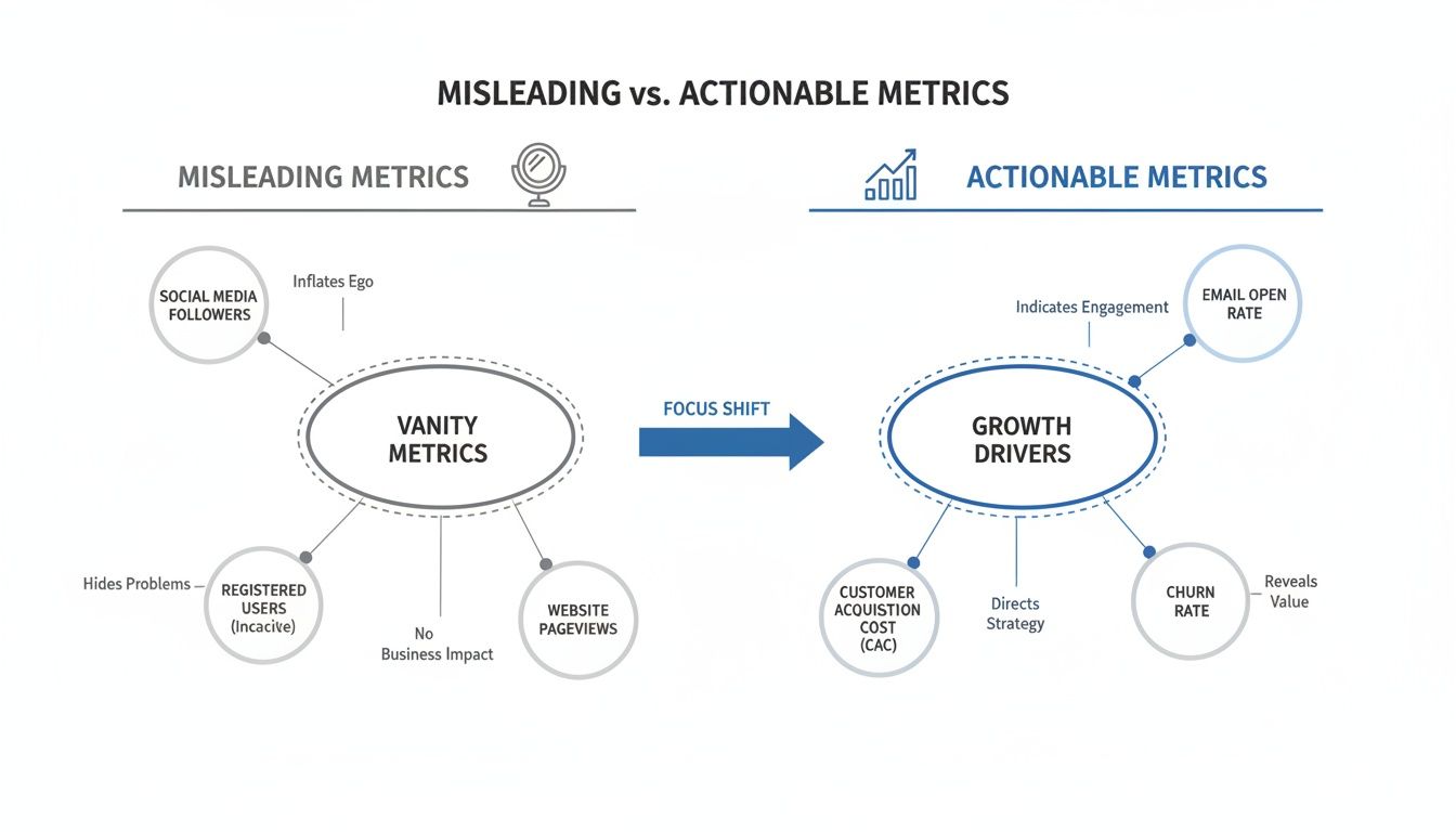
A diagram comparing misleading vanity metrics like followers to actionable growth drivers like churn rate.
This highlights how focusing on actionable drivers like churn rate and conversion provides a far more accurate picture of business health than surface-level numbers like follower counts.
Pillar 4: Core Revenue Metrics
This is where the rubber meets the road. Revenue metrics are the ultimate lagging indicators of success, reflecting the financial health and growth trajectory of your business. These are the numbers your board and investors really care about.
Key revenue metrics are:
- •Monthly Recurring Revenue (MRR): The predictable revenue you can expect to receive every single month.
- •Customer Lifetime Value (CLV): The total revenue a business can reasonably expect from a single customer account over their lifetime.
- •Revenue Churn: The percentage of MRR lost from existing customers in a given period.
Getting the math right on these is absolutely vital. For a deeper dive, there’s a helpful guide on calculating Customer Lifetime Value (CLV) that breaks down the specifics for SaaS models.
Pillar 5: Operational Efficiency Metrics
Finally, efficiency metrics measure how sustainable your growth engine truly is. It’s not enough to grow; you have to grow profitably. These metrics analyze the costs associated with acquiring and serving customers, ensuring your go-to-market model is actually scalable.
Crucial metrics here include:
- •Customer Acquisition Cost (CAC): The total cost of sales and marketing needed to acquire a single new customer.
- •CAC Payback Period: The number of months it takes to earn back the money invested in acquiring a customer.
- •Sales Cycle Length: The average time it takes to close a deal, from the very first touch to the final signature.
By organizing your performance metrics across these five pillars, you create a comprehensive diagnostic tool that connects every team’s efforts directly to revenue.
Choosing Performance Metrics That Drive Business Impact
Having a long list of performance metrics is easy. Having the right ones is a different story. The single biggest mistake scaling SaaS companies make is tracking vanity metrics—the ones that are easy to measure but have a weak, indirect link to revenue. This is how you end up with busy teams and flat growth curves.
To fix this, you need a repeatable process for tying every single KPI back to a business outcome. The trick is to work backward. Don't start with a list of metrics you could track; start with the strategic goals you must hit. This simple shift ensures every piece of data you collect actually has a job to do.
From Goals to Action with the GQM Framework
The Goal-Question-Metric (GQM) framework is a deceptively simple tool that forces this critical alignment. It’s a structured way to get from abstract business objectives to the concrete data points you need to track, connecting the "why" (your goal) to the "what" (your metric) by asking the right questions.
It's a straightforward, three-step process:
- •Goal: State a clear, high-level business objective. What are we trying to achieve?
- •Question: Ask specific, probing questions that tell you if you're actually on track to hit that goal. What do we need to know?
- •Metric: Identify the exact performance metrics that can answer those questions with cold, hard data. What do we need to measure?
Following this process transforms your data from a passive report card into an active diagnostic tool. You stop measuring for the sake of measuring and start pinpointing the real bottlenecks holding back your growth.
Putting GQM into Practice
Let's walk through a real-world example. Imagine your leadership team sets a critical business objective for the next two quarters.
- •Goal: Increase enterprise ARR by 25% in the next six months.
That’s a great top-line goal, but your RevOps team can’t execute on it directly. It’s too vague. Now, we use the GQM framework to break it down into diagnostic questions they can actually answer.
- •Question 1: Where are our most valuable deals getting stuck in the pipeline?
- •Question 2: Is our sales team spending their time on qualified, high-value opportunities or administrative fluff?
- •Question 3: Are we turning the interest marketing generates into real sales pipeline?
These questions give you a clear direction. Now you can pick the specific metrics that provide the answers.
- •Metric for Q1: Sales Stage Velocity. This tells you exactly how long deals are sitting in each stage of your sales cycle. If enterprise deals are bottlenecking in the "Negotiation" stage, you know precisely where to focus your coaching and resources.
- •Metric for Q2: Sales Time-on-Task Analysis. A quick look at CRM data might reveal that your reps are buried in admin work instead of selling. This metric could show that only 30% of a rep’s day is actually spent on core selling activities—a massive red flag.
- •Metric for Q3: MQL-to-SQL Conversion Rate. This tracks the percentage of marketing-qualified leads that your sales team accepts as legitimate opportunities. A low rate here screams misalignment between your marketing campaigns and your ideal customer profile. You can dive deeper into this with our guide on essential marketing analytics.
This hands-on approach ensures every RevOps effort is aimed directly at a measurable outcome. The foundational principles of measuring software quality offer a great parallel here, emphasizing that good metrics are always clear, relevant, and directly tied to user value.
"What gets measured gets managed." - Peter Drucker
This idea is the very heart of effective RevOps. It's a principle that applies on a macro scale, too. Economic growth projections for the MENA region from 2015-2021 were notoriously volatile. By October 2019, GDP growth was projected at a meager 0.6%, a clear signal of deep structural challenges needing targeted reforms. Whether you're managing a national economy or a sales pipeline, the right metrics are the only way to diagnose problems and drive real improvement.
Building a Reliable Data and Attribution System

Modern office interior with a blue wall display, glass partitions, and a wooden reception desk.
Here's a hard truth: your powerful performance metrics are completely useless if they’re built on a foundation of bad data. Once you’ve picked the right KPIs, the real work begins—building the technical plumbing that makes them trustworthy. This is where theory crashes into reality, and where most revenue operations fall apart.
We’ve all seen it. The "garbage in, garbage out" disaster. Inconsistent UTM parameters, broken tracking scripts, and data siloed between your CRM and marketing tools create a complete mess. The result? Endless arguments in meetings over whose numbers are right—sales or marketing—instead of focusing on hitting your targets.
The goal is to establish a single source of truth that your entire go-to-market team trusts without question. That requires a rock-solid technical setup and a smart approach to attribution.
Choosing the Right Attribution Model
Attribution isn’t just about giving credit where it's due. It's about deeply understanding the customer journey so you can invest your time and money where it counts. Different models tell different stories about what really influenced a deal, and the right one for you depends entirely on your GTM strategy and how long your sales cycle is.
Here are the most common models you'll encounter:
- •First-Touch Attribution: This model gives 100% of the credit to the very first interaction a lead has with your brand, like clicking a social media ad. It’s simple, but it completely ignores all the nurturing that happens later on.
- •Last-Touch Attribution: The exact opposite of first-touch. This gives all the credit to the final action before a conversion, like a demo request. It highlights what’s working at the bottom of the funnel but ignores everything that got the prospect there.
- •Multi-Touch Attribution: This is where things get much more insightful. Models like Linear, U-shaped, or W-shaped spread the credit across multiple touchpoints. For any business with a sales cycle longer than a few days, this is almost always the most accurate approach.
Simpler models like first- or last-touch are easier to set up, but they can give you a dangerously skewed picture of reality. Multi-touch models, while more complex, offer a much more complete view of what’s actually driving revenue.
"Data without a question is just a distraction." – A wise RevOps leader
This quote gets right to the heart of it. Your attribution model needs to be chosen to answer your most critical business questions, like, "Which marketing channels are bringing us our most valuable customers?" For a deeper look at connecting these data points to real business outcomes, check out our guide on the power of revenue intelligence.
From Model to Implementation
Once you've landed on a model, the next phase is all about disciplined execution. This means enforcing ruthless data hygiene across every single one of your systems. Every lead source needs to be tracked consistently, every UTM parameter must follow a strict, standardized format, and every touchpoint has to be captured in your CRM.
This isn't the glamorous side of RevOps, but it is absolutely non-negotiable. Without this operational rigor, your dashboards and reports are built on sand.
Using platforms like HubSpot to automate data capture and validation can drastically cut down on human error. This AI-powered approach amplifies truth, not noise, ensuring your attribution system reflects what's actually happening, not just guesswork. Once this foundation is in place, you can finally move past the data debates and start having strategic conversations about growth.
Creating Dashboards That Inspire Action

A person points at a laptop displaying an actionable data dashboard with various charts.
Let's be brutally honest: a collection of charts and graphs is not a strategy. Data is only useful if it’s seen, understood, and—most importantly—acted upon. The best performance dashboards aren't designed to just report what happened last quarter. They're built to guide what should happen next.
Think of it this way: your data dashboards should be the central nervous system for your entire revenue organization, transforming passive numbers into real-time operational intelligence.
This means you have to kill the one-size-fits-all dashboard. Your CEO and your sales manager care about fundamentally different things. A dashboard that tries to serve everyone ultimately serves no one, quickly becoming a vanity project that gathers digital dust. True value comes from tailoring visualizations to answer the specific questions each role is wrestling with every single day.
Designing Dashboards for Different Roles
The real skill here is filtering the signal from the noise. Each leader needs a curated view focused only on the metrics they can directly influence. For example, overwhelming a sales rep with LTV:CAC ratios is completely counterproductive. They need to see their pipeline velocity and activity metrics right now.
This is where role-based dashboards, built directly in platforms like HubSpot or Salesforce, become a game-changer. They give each leader the precise data they need without forcing them to wade through irrelevant information.
Here’s a quick overview of what key metrics are most relevant for different roles within a SaaS organization.
Role-Based Dashboard Metrics
| Role | Primary Metrics to Track | Key Questions Answered |
|---|---|---|
| CEO / Executive | ARR Growth, LTV, CAC Payback Period, Net Revenue Retention (NRR) | Are we growing sustainably? Is our business model healthy? Where should we invest next? |
| Sales Leadership | Pipeline Coverage, Win Rate by Rep, Average Sales Cycle Length, Quota Attainment | Are we on track to hit our number? Where are deals getting stuck? Who needs coaching? |
| Marketing Leadership | MQL-to-SQL Conversion Rate, Cost Per Acquisition by Channel, Pipeline Generated | Which channels are driving actual revenue? Is our marketing spend efficient? Are we delivering quality leads? |
| Customer Success | Net Revenue Retention (NRR), Gross Revenue Retention (GRR), Churn Rate, Expansion MRR | Are our customers succeeding? Who is at risk of churning? Where are our upsell opportunities? |
By tailoring views this way, you make the data immediately relevant and actionable for the person looking at it, which is the entire point.
The Critical Role of Data Governance
Even the most beautiful dashboard is completely useless if nobody trusts the numbers. This is where data governance becomes non-negotiable. Without it, you're building a skyscraper on a foundation of sand, which only leads to confusion, arguments, and total inaction.
The greatest challenge to data-driven decision-making is a lack of trust in the data itself. If your teams are constantly questioning the source or definition of a metric, you've already lost.
Effective data governance isn’t some overly complex bureaucratic process; it’s just about establishing clear rules of the road. It starts with creating a shared data dictionary. Does everyone in sales, marketing, and success agree on the exact definition of a Marketing Qualified Lead (MQL)? Who "owns" the Win Rate metric and is responsible for its accuracy? Establishing this clarity is absolutely fundamental.
Unfortunately, many organizations—and even governments—struggle with data transparency. For instance, an Open Data Barometer assessment noted that most MENA countries were backsliding on open data, with only 66% of analyzed data available online and heavy restrictions on key datasets. You can see the full regional snapshot on opendatabarometer.org. While this reflects a national scale, the principle holds true inside your company: restricted or untrustworthy data blocks progress.
Setting a clear review cadence and defining ownership for each key metric transforms your dashboards from a simple reporting tool into a powerful accountability engine.
To learn more about turning data into actionable insights, explore our complete guide to revenue analytics.
Avoiding Common Mistakes in Metric Analysis
The road to becoming a data-driven company is full of potholes. Just having dashboards and performance metrics isn’t the finish line; knowing how to read them without fooling yourself is where the real work begins. Too many SaaS companies get this wrong, falling into common traps that lead to flawed strategies and burned cash.
Understanding these mistakes is the first step toward building an insightful revenue operation. It’s about cultivating the discipline to look past the surface-level numbers and start questioning the assumptions hiding behind them.
Confusing Correlation with Causation
This is the oldest data analysis mistake in the book. Just because two metrics move together doesn’t mean one is causing the other. For instance, your marketing team spins up a new ad campaign, and that same week, your trial-to-paid conversion rate tanks. The knee-jerk reaction? Blame the campaign for driving low-quality leads.
But what if a deeper look revealed that a bug was pushed to your new user onboarding flow during the same deployment? The ad campaign and the conversion drop were correlated in time, but the bug was the actual cause of the problem.
"The first rule of any technology used in a business is that automation applied to an efficient operation will magnify the efficiency. The second is that automation applied to an inefficient operation will magnify the inefficiency." - Bill Gates
This is exactly why acting on surface-level correlations is so dangerous. To avoid this trap, you have to pair your quantitative data with qualitative feedback. Dig into user session recordings, get on the phone with your sales reps, and read customer support tickets to find the "why" behind the "what."
Acting on Lagging Instead of Leading Indicators
Most teams are obsessed with lagging indicators like Monthly Recurring Revenue (MRR) or customer churn. They're essential for reporting on what already happened, but they tell you absolutely nothing about what’s coming next. By the time your MRR takes a nosedive, the damage is already done.
Leading indicators, on the other hand, are predictive. They're the early warning system that tells you something is about to go right—or terribly wrong.
- •Lagging Indicator: Customer Churn Rate jumps by 5% this month.
- •Leading Indicator: Product engagement scores for those same at-risk accounts dropped by 30% three months ago.
By focusing on leading indicators—like product activation rates, new feature adoption, or a sudden dip in daily active users—you can intervene before the disaster hits. It’s the difference between reacting to problems and preventing them in the first place.
Letting Data Silos Distort the Truth
When your marketing, sales, and customer success teams all operate from different spreadsheets and dashboards, you don't have a single view of the business. You have a fractured mess. Marketing might be celebrating a record number of MQLs, while sales is complaining that lead quality has completely fallen off a cliff, tanking their MQL-to-SQL conversion rate.
This misalignment is toxic. Each department starts optimizing for its own siloed metrics, often hurting the overall customer journey and the company's revenue goals. We see it all the time: a sales leader reports 80% follow-up compliance on new leads, but a quick look at the CRM data shows only 25% of those leads were actually touched within the first 24 hours.
Breaking down these silos requires a single source of truth, almost always anchored in your CRM and governed by a RevOps function. When everyone is looking at the same dashboard with agreed-upon definitions for every KPI, you kill the "your data vs. my data" arguments and get the entire organization focused on the same outcomes.
Burning Questions About Performance Metrics
We get these questions all the time from SaaS leaders trying to nail down their RevOps strategy. Here are some quick, straight-to-the-point answers to help you cut through the noise.
What's the Real Difference Between a Metric and a KPI?
Think of it like this: a metric is any number you can count. Website visitors, new leads, demo requests—they’re all just raw data points. You can track hundreds of them.
A Key Performance Indicator (KPI), on the other hand, is a metric you’ve hand-picked because it tells you something critical about your business goals. Your MQL-to-SQL conversion rate isn't just a number; it’s a direct signal of how well your sales and marketing teams are actually working together.
Bottom line: all KPIs are metrics, but only a handful of metrics are important enough to be KPIs.
How Often Should We Actually Look at Our Metrics?
There’s no magic number here. The right rhythm depends entirely on how fast the metric moves and how important it is to your immediate goals.
- •Weekly: This is for your high-velocity, operational stuff. Think new MQLs, trial signups, or sales demo requests. A weekly check-in lets you spot problems or positive trends before they snowball.
- •Monthly: This cadence is perfect for core business drivers like MRR growth, sales cycle length, and pipeline coverage. It’s about tracking performance against your monthly targets.
- •Quarterly: Save this for the big, slow-moving strategic metrics. Things like Customer Lifetime Value (LTV) and CAC Payback Period are perfect for quarterly leadership and board meetings where you’re discussing long-term health.
The key is consistency. Set a cadence for each dashboard and stick to it. That’s how you build accountability.
If a Startup Could Only Track One Metric, What Should It Be?
For any early-stage SaaS startup, it’s almost always the Monthly Recurring Revenue (MRR) growth rate. No question.
This single number is incredibly powerful because it’s a proxy for everything else that matters: market validation, product-market fit, and your overall growth trajectory. It’s the clearest signal you can send to investors—and your own team—that you're on to something big. If that number is growing consistently, your core business model is working.
How Do We Make Sure Our Data Is Actually Accurate?
You can't make good decisions with bad data. Accuracy is everything, and it starts with a solid technical foundation and a little operational discipline.
First, you need a single source of truth. Use a centralized system like a customer data platform (CDP) or just your CRM to standardize how you collect data from all your different tools.
Next, create a data dictionary. This sounds boring, but it's critical. It’s a simple document where you agree on one definition for every single metric. What exactly is an "MQL"? Write it down.
Finally, do regular data audits. Get in there and look for tracking bugs or inconsistencies. Catching these issues early stops them from polluting your reports and leading you down the wrong path.
By implementing this framework, you can expect a 15–25% improvement in pipeline velocity within just 6 weeks. Are you ready to stop guessing and start growing? Learn how the 6-Week Revenue Growth Sprint applies this framework to your business.